|
I was playing around with some Google Charts yesterday and I stumbled across their Calendar charts. I thought it would be cool to display changes in Fitbit activity by displaying step differentials using this visualization.
The legend is as follows:
The chart above shows 145 days of data with varying levels of competition. Unfortunately for me, there are mostly blue cells. Will's a runner, so unfair advantage, right? With the exception of September, I beat Will's step count for a total of 7-8 days out of the month. In September I beat his step count for a total of 14 days. Still, that was only 46% of the days in July. Go Will! He takes the lead 75% of the time. You can see the cell colors becoming lighter from July to November. In other words, the step counts were converging, meaning 1 of 2 things: 1) We got more competitive, or 2) we both got less competitive as time went on. See for yourself below:
Looks like a slight downward trend from August to November.
These cool charts were made in Stata and use Google Charts API :)
0 Comments
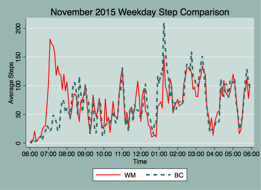
For November's Fitbit comparison, I'll be using 5-minute interval data during the workweek between the hours of 6 AM to 6 PM. I've averaged the 5-minute intervals and graphed them below. My steps are outlined in the green dashed lines and Will's are in solid red lines. Seeing as Christmas is only 6 days away (can you believe it?) I've made these graphs look more festive! As you can see, I got plenty of steps from 12:30 to 1:30, on my lunch break as I walk puppy Hayek during that time. On average, the lunch hour step activity reflect my peak steps for the workday, whereas Will's peak step count happens much earlier, around 7 AM. I usually get to work around 8-8:30 AM, and from that point onward our step correlation is approximately 0.80. After 12 PM, our step correlation is about 0.84 as we sometimes go on walks around the campus during our breaks after lunch. Below are some graphs detailing total step counts during 5-minute intervals for a few days in November: Walking breaks stand out in this graph as step counts climb pretty quickly. Also, simultaneous walk breaks are evident as the total step activity shows for November 24.
Pretty soon people will be out of the office as vacations come up and as the year winds down, present company included :) I look forward to seeing what my step count looks like while on vacation. I will keep you all posted!
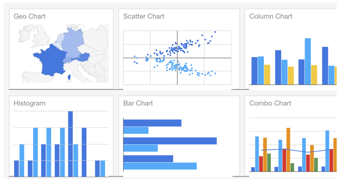
Not long ago, I was introduced to Google Charts. Ever since, I've been obsessed. I now love using Stata and combining it with Google Charts. Step 1: Clean data using Stata, Step 2: present data using Google Charts. Result: Easy to read and aesthetically pleasing visualizations for my website. Perfect.
Last month, I scraped Hayek's instagram data and made a paw-some map from the extracted latitude/longitude pairs using Google Charts and an .ado file that I came across thanks to Will, written by a former coworker of his called gmapmark which writes an .html file that creates a Google map. See said map in my dog blog: http://www.belenchavez.com/hayek/dog-friendly-sd
I decided to improve that program by incorporating the ability to have different markers for the data points by using web addresses that point to .png, .gif or .jpg images (like I did for the paw prints above). I've also added the ability to name your data points, instead of simply showing the latitude/longitude information. I've called that program gcmap short for Google Charts map. For more on making map visualizations check out Google Charts.
Example 1:
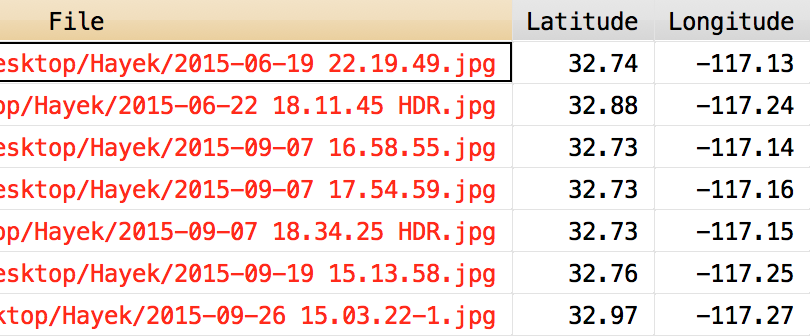
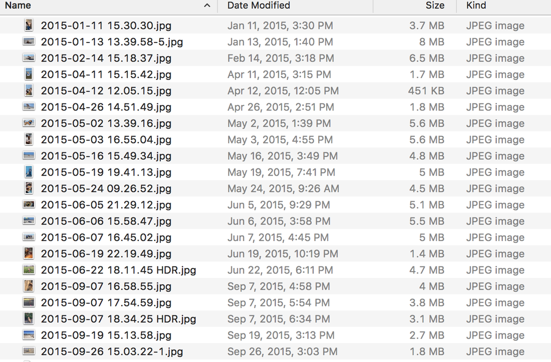
Do you own an iPhone? Do you use Photos? While I do use the Photos app on my phone, I don't like it on my computer, so I keep a separate folder of uploaded pictures that Photos doesn't touch. Back to the point, one of the features that Photos has is the ability to make a map of your pictures if your pictures have location information. Did you know that we can also make such a map using Stata and Google maps? You didn't? Well, now you know :) Let's say I want to make a Google map from several pictures I have in a folder called Hayek. How do I do that? Well first, I will extract the latitude and longitude information using exiflatlon that I have thanks to Will's post on exif information. clear version 12.1 cd Hayek exiflatlon, dir() clear * Exclude files missing lat/long data drop in 1/14
This makes the following dataset with latitude and latitude information from exif data in the pictures contained in the following folder:
I type the following into Stata after downloading gcmap and placing it in my personal ado folder. In the following example, I want the name() of the data points to be the file names from above contained in the variable "File". The option nor() contains the web location of the icon to display for the data points, which is short for normark(). The sel() option contains the web location of the icon I want to use for once a data point is selected on the map, it's short for selmark().
gcmap using "hayek_paws.html", latitude(Lat) longitude(Lon) name(File) ///
        zoom(11) ///
        nor(http://www.belenchavez.com/uploads/5/6/9/3/56930511/9243470_orig.png) ///
        sel(http://www.belenchavez.com/uploads/5/6/9/3/56930511/5261019_orig.png) ///
        replace
Which makes the following map:
Note: I could have left the nor() and the sel() options empty and this would have made a map with the usual red balloon marker points. See example below.
Example 2: I can also make a Google map from the Google location history data I have for a couple of days back in October and use the time stamp as the name for each point. Here, I don't specify nor() or sel(), so the default map markers show up. gcmap using "trip.html", lat(latitudeE7) long(longitudeE7) name(tstamp)
And there you have it! Now you too can use gcmap to make cool Google maps using Stata. Easy, right?
So today we decided we wanted to go shop at an outlet mall, but the question was, which one to choose? We could either go to Carlsbad Premium Outlets up in North County or Las Americas Premium Outlets right by the border.
To help make the decision, we looked up what stores the outlets had. I searched online for a solid comparison of the two outlets but results were slim and the only things I found were old threads on Yelp! or TripAdvisor comparing the quality of the two. The Simon websites do have a list of the stores at each outlet, but it was hard to go through the list and switch windows to see differences/similarities in store listings. See store directories for Las Americas and Carlsbad. Here is an easy to read table that you can SORT by clicking on the outlet names. Cool, huh?
This list also includes restaurants and kiosks. Carlsbad has a total of 101 shops, and Las Americas has a grand total of 169 shops. So you could probably guess where I went :)
I made the table above by copying the store listings to text files, importing them to Stata, cleaning up the variables, renaming the stores to have proper() case before merging the two datasets. Finally, I used Google Charts API to display the results. |
AuthorMy name is Belen, I like to play with data using Stata during work hours and in my free time. I like blogging about my Fitbit, Stata, and random musings. Archives
March 2018
Categories
All
|
||||||||||||


