|
Happy Valentine's Day! Combine today with Stata and you get a heart shaped graph. The one I made below was made using graph3d in Stata.
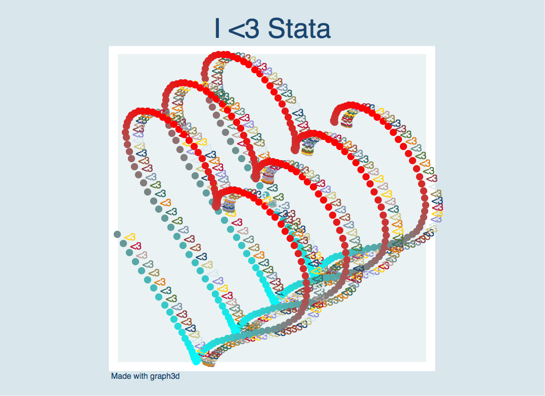
Did you notice I also used the "<3" marker labels here? Hearts on hearts on this graph ;)
Below is the code I used to make the heart graph. I added the title, note, and other options using the graph editor.
/* Author: Belen Chavez
     Stata Heart Code
     Happy Valentine's Day <3 */

clear all
set obs 463
gen t = .
local c = 1
forv i = 0(0.05)`=2`c(pi)''{
        replace t = `i' in `c'
        local ++c
}

gen x = 16*sin(t)^3
gen y = 13*cos(t)-5*cos(2*t)-2*cos(3*t)-cos(4*t)
gen mlab = "<3"
graph3d x y t , colorscheme(cr) scale(3) markeroptions(mlab(mlab))
Happy Valentine's Day to my blog readers <3
1 Comment
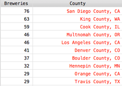
Let's get local. I'm talking about San Diego beer. This is the third post regarding data I've downloaded and cleaned from BreweryDB. For a while now, I've been wanting to map all the breweries in San Diego County. Why? Well, for starters, San Diego is a great place for craft beer enthusiasts and I keep hearing about how many breweries there are in SD County. Secondly, why not? If you've got the data, use it. So now with BreweryDB and their brewery information, I can finally do that. See the map I made below. Note, however, that this map doesn't include ALL breweries in SD County. The data from BreweryDB that I downloaded is only for breweries that had at least one "verified" beer entry in their database. Also, I only included unique breweries, leaving out tasting rooms or additional brewery locations. This left me with 76 breweries which have been mapped below:
This visualization was made with Stata and Google Charts API using the links to brewery icons from BreweryDB. Any breweries without icons are shown with default red markers.
Of the available beers in BreweryDB for these 76 SD County breweries, the make-up of beer styles is as follows:
It's a pretty good variety of beer and it's great if you love Pale Ales, IPAs or Double IPAs as those seem to be the most common types of beers brewed in SD (within the North American Origin Ales category).
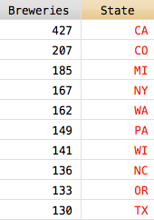
Using Stata's gpsbound command, the 2010 Census county shape files, and the latitude and longitude brewery information within the BreweryDB dataset, I summed up the number of breweries in each county and each state.
*This only includes breweries from BreweryDB that had at least one verified beer entry in the database.
California ranks first in terms of unique breweries among states and San Diego County ranks first among the counties from this dataset. San Diego is a pretty great place if you like craft beer (and even if you don't, San Diego is a pretty likable place with perfect weather). The breweries here make all kinds of beers and most tasting rooms are dog and family friendly. Go check one out if you're around. Some of my favorite SD County breweries are:
This is a continuation of the work I did in part 1 using BreweryDB data. I've cleaned most files with brewery and beer information (only 44 files could not be parsed using insheetjson in Stata, but I'm working on those separately, they will be included in my analysis at a later time). For now, this analysis only includes files which I was able to parse.
So, who makes beer? Breweries. What styles are there? Well let me tell you. There are the following styles in BreweryDB. Under each style there are up to 170 beer categories (or sub-styles?) like the ones I described in Part 1.
Looks like the unique count of breweries with North American Origin Ales style surpasses all other counts with close to 3,500 in this (somewhat complete) sample. With the explosion of micro-breweries, and all kinds of people getting into beer, I guess I'm not too surprised. So, what types of beers are contained within this style? I've summarized them here. The top 50% of the North American Origin Ales are made up by the following styles: American-Style India Pale Ale (19%), American-Style Pale Ale (15%), American-Style Amber/Red Ale (11%) and the Imperial or Double India Pale Ale (9%). See table below.
Interesting. To be honest, I don't like IPAs, pale ales, or IIPAs. They're just too hoppy for my taste. Pass me a Belgian instead. On that note, here are the counts of breweries who make Belgian & French Origin Ales.
A lot lower than the North American Origin Ales, but with the IPAs growing out of control (or so it feels like they are here in San Diego), I guess that makes sense. Plus, while there are fewer breweries that make Belgian and French Ales these types of beer seem to have been around longer. For example, the earliest established brewery with Belgian and French Ales is in 1121 by Leffe versus 1471 for the earliest North American Ale which interestingly enough corresponds to the beer style "Golden or a Blonde Ale" made by none other than a Belgian Brewery: Hetanker. Aren't Belgian breweries just the best?
I've mapped the breweries that make Belgian and French Origin Ales below that are located in California, Texas, North Carolina, New York, and D.C. Why these states? These are the states where most of my site's visitors are from :)
Like I said in the first post, there's a lot of data and I've only shown you a little bit of it! Look forward to more posts that use additional variables that I haven't even mentioned and maybe cooler maps. Cheers!
A few days ago, I attended the San Diego Economic Roundtable at the University of San Diego which included a panel of experts discussing the economic outlook for San Diego County. My favorite speakers were Marc Martin, VP of Beer, from Karl Strauss and Navrina Singh, Director Product Management, from Qualcomm. Singh had a lot to say about data, technology, innovation and start ups in San Diego County. Did you know that there are 27 coworking spaces, accelerators, and incubators in San Diego? I sure didn't. Martin's discussion of beer, all the data he showed, along with some cool maps, sparked this blog post which has been a long time coming. In case you don't know, I'm quite the craft beer enthusiast! Allow me to nerd out as two of my favorite things come together: data and craft beer.
Martin's talk focused on the growing number of microbreweries and craft beer data. Here are some cool facts I came away with from his presentation that are worth mentioning again:
On to my blog post: While searching for beer data for this blog post, I stumbled across a gold mine: BreweryDB.com. I got access to their data using API. In the last few days, I've looped through over 750 requests using Stata's shell command and Will's helpful post on Stata & cURL. In the table below I've detailed the number of beers (listed as results) under each style ID in BreweryDB's database. There are a total of 48,841 beers as of January 17, 2016. When filtering for the word "Belgian" in the style name, I got a total of 5,883 beers. Can you guess what my favorite type of beer is? :) I made the table below using Google Charts API table visualization. There are a total of 170 beer style IDs under BreweryDB and I've summed up the number of beers under each style. You can sort by ID, Beer Style or Results by clicking on whichever column title you'd like.
Disclaimer: This product uses the BreweryDB API but is not endorsed or certified by PintLabs.
Seeing as BreweryDB's data is extensive and I'm oh-so excited to share with you some of my findings, I've decided to make a series of blog posts about this. This is why this is part 1. This is only the tip of the iceberg, my friends, and I'm not sure how big of an iceberg I'll be uncovering, but stay tuned for more.
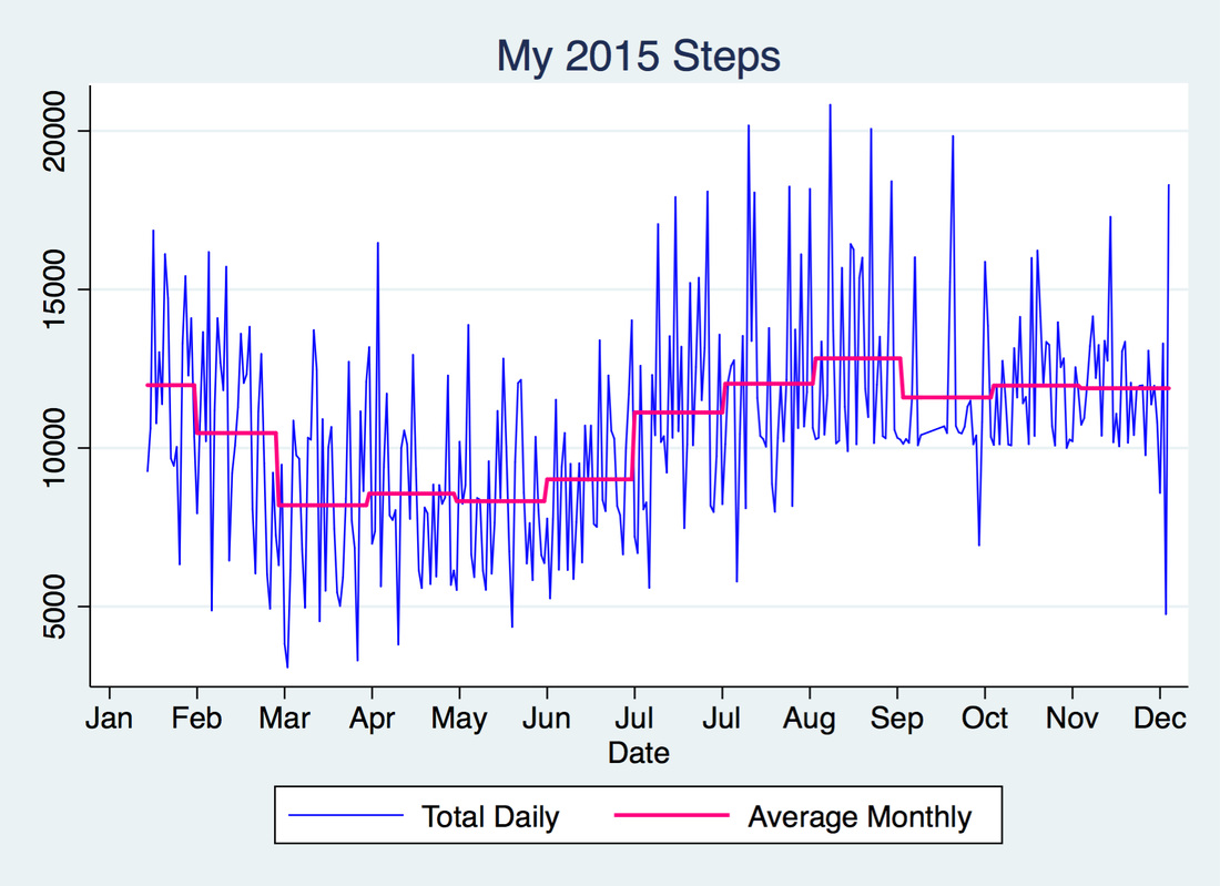
I got my Fitbit on January 15, 2015 and I have been obsessed with it ever since (sorry not sorry, friends and family). I figured that now that 2015 is over, I'd look at my step trends for the year. The graph above shows my total daily steps in blue and my average monthly steps in pink. As you can see, my average daily steps went up after July and remained above 10k throughout the end of the year.
I wasn't meeting goal very often before July and this is evidenced in the graph below. It counts how many times I missed my step goal for every month in 2015: 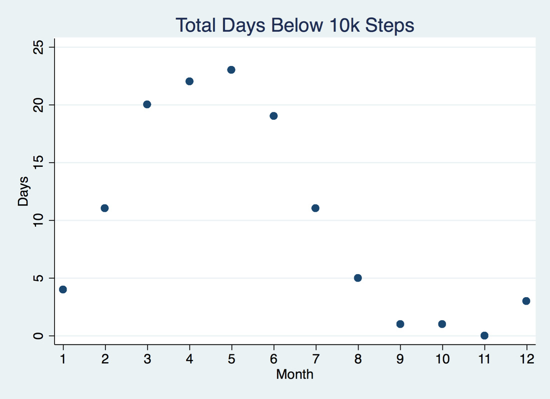
I got better at meeting goal and became more competitive as more people I knew (like Will) got Fitbits and challenged me with Fitbit's Goal Day, Weekend Warrior, Daily Showdown and Workweek Hustle challenges.
Using Stata and Google Charts API I made the following graphic which shows my steps above or below my goal of 10k.
This was motivated by my Fitbit & Google Calendar Chart blog post. The legend is similar:
This includes a total of 344 days. My average daily steps for 2015 was 10,593 steps, and for the months of July through December was 11,910. Also, as the Stata graphs above illustrate, the months of February through June show a lot of days where I missed my step goal. For 2016, I'm aiming to have a lot more blue cells with darker shades of blue. That's my resolution :) Happy New Year! I was on vacation for the last couple weeks of December and the first week of January, so apologies for the lack of updates. Last month, I was hoping to reach above 25k steps and was striving to maintain my 10k step goal streak. Unfortunately, neither of those were realized. To be fair, getting steps in while on vacation is pretty difficult when all venues you go to require driving. Also, the time change really messed up my schedule (it's a 5 hour difference), it was too hot sometimes, and a little dangerous at times in terms of safety. I know, excuses excuses, but I tried! Really! There were times where I walked by myself, went on runs by the beach, and used the treadmill. Who brings running shoes to vacation? This girl, because goals need to be met and Brazilian food is too delicious. Anyway, on to the December update. Below are the total daily steps for Will and me for last month. 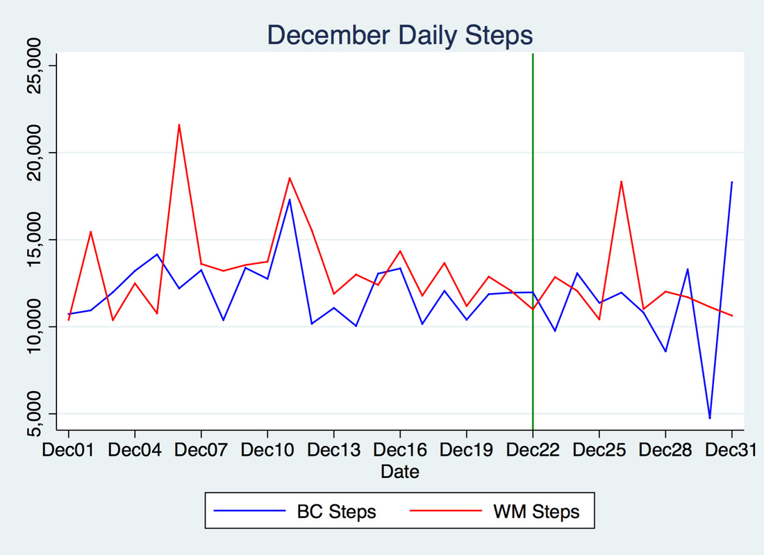 Both of us were out of the office beginning on December 22 which is denoted by the vertical green line. Will's steps are in red and my steps are in blue. As expected, Will met goal every day. Good job, Will! I however, did not meet goal for 3 days last month. Below are my vacation days up through Thursday: 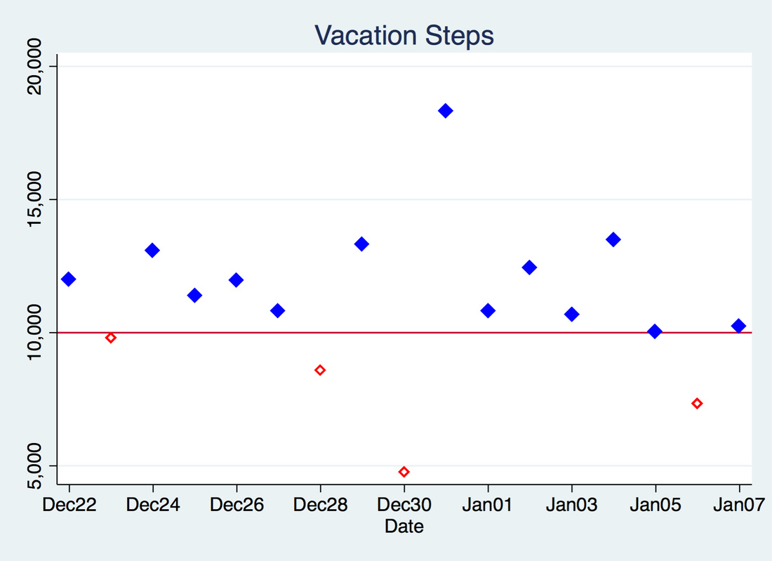 Ok, whoa! Below 5000 steps? I know...Insert extremely embarrassed emoji here. That day, I woke up pretty late around 10 am and went to the beach with my friends up until 4 pm, after which we went to dinner. I later went out with my fiancé and his friends. So no time for walking.
On the 23rd, I arrived in Brazil and due to the time difference I only got 9,773 steps. I was pretty mad about that one. On the 28th I had 1500 steps to go and didn't meet it due to step procrastination (I had 2k steps to go as of 11 PM and figured I'd meet goal during that hour - we went out for a late dinner so sitting was how I spent that last hour). On January 6 I was traveling to the airport and spent most of the day packing, preparing for my trip, and saying good-bye to people, so I only got 7,327 steps. Really bummed about that one because I was hoping for a goal streak in 2016. Womp womp. Anyway, as of today I have 64 days until the San Diego Half Marathon and I am certain step goals will be met due to training. Stay tuned!
I was playing around with some Google Charts yesterday and I stumbled across their Calendar charts. I thought it would be cool to display changes in Fitbit activity by displaying step differentials using this visualization.
The legend is as follows:
The chart above shows 145 days of data with varying levels of competition. Unfortunately for me, there are mostly blue cells. Will's a runner, so unfair advantage, right? With the exception of September, I beat Will's step count for a total of 7-8 days out of the month. In September I beat his step count for a total of 14 days. Still, that was only 46% of the days in July. Go Will! He takes the lead 75% of the time. You can see the cell colors becoming lighter from July to November. In other words, the step counts were converging, meaning 1 of 2 things: 1) We got more competitive, or 2) we both got less competitive as time went on. See for yourself below:
Looks like a slight downward trend from August to November.
These cool charts were made in Stata and use Google Charts API :) For November's Fitbit comparison, I'll be using 5-minute interval data during the workweek between the hours of 6 AM to 6 PM. I've averaged the 5-minute intervals and graphed them below. My steps are outlined in the green dashed lines and Will's are in solid red lines. Seeing as Christmas is only 6 days away (can you believe it?) I've made these graphs look more festive! 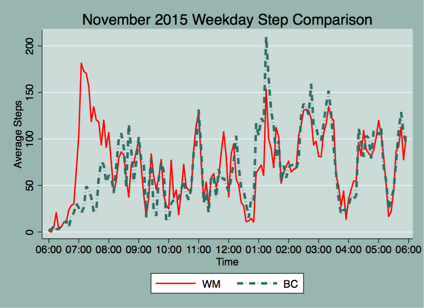 As you can see, I got plenty of steps from 12:30 to 1:30, on my lunch break as I walk puppy Hayek during that time. On average, the lunch hour step activity reflect my peak steps for the workday, whereas Will's peak step count happens much earlier, around 7 AM. I usually get to work around 8-8:30 AM, and from that point onward our step correlation is approximately 0.80. After 12 PM, our step correlation is about 0.84 as we sometimes go on walks around the campus during our breaks after lunch. Below are some graphs detailing total step counts during 5-minute intervals for a few days in November:  Walking breaks stand out in this graph as step counts climb pretty quickly. Also, simultaneous walk breaks are evident as the total step activity shows for November 24.
Pretty soon people will be out of the office as vacations come up and as the year winds down, present company included :) I look forward to seeing what my step count looks like while on vacation. I will keep you all posted!
Not long ago, I was introduced to Google Charts. Ever since, I've been obsessed. I now love using Stata and combining it with Google Charts. Step 1: Clean data using Stata, Step 2: present data using Google Charts. Result: Easy to read and aesthetically pleasing visualizations for my website. Perfect.
Last month, I scraped Hayek's instagram data and made a paw-some map from the extracted latitude/longitude pairs using Google Charts and an .ado file that I came across thanks to Will, written by a former coworker of his called gmapmark which writes an .html file that creates a Google map. See said map in my dog blog: http://www.belenchavez.com/hayek/dog-friendly-sd
I decided to improve that program by incorporating the ability to have different markers for the data points by using web addresses that point to .png, .gif or .jpg images (like I did for the paw prints above). I've also added the ability to name your data points, instead of simply showing the latitude/longitude information. I've called that program gcmap short for Google Charts map. For more on making map visualizations check out Google Charts.
Example 1:
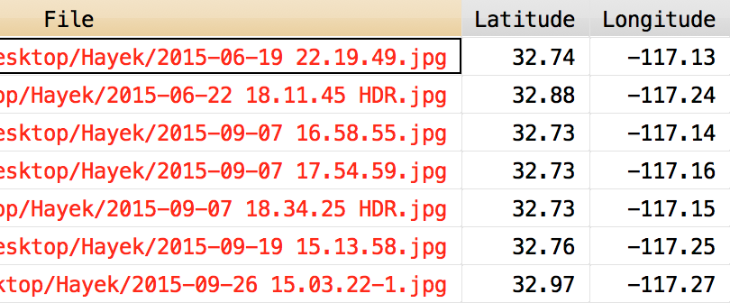
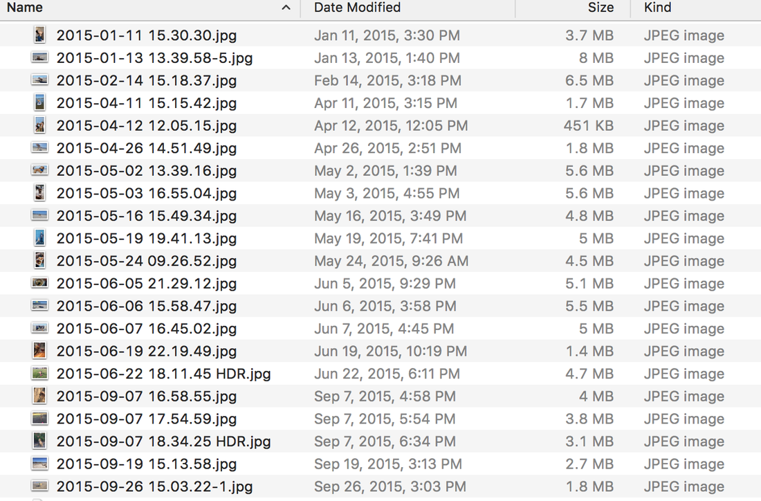
Do you own an iPhone? Do you use Photos? While I do use the Photos app on my phone, I don't like it on my computer, so I keep a separate folder of uploaded pictures that Photos doesn't touch. Back to the point, one of the features that Photos has is the ability to make a map of your pictures if your pictures have location information. Did you know that we can also make such a map using Stata and Google maps? You didn't? Well, now you know :) Let's say I want to make a Google map from several pictures I have in a folder called Hayek. How do I do that? Well first, I will extract the latitude and longitude information using exiflatlon that I have thanks to Will's post on exif information. clear version 12.1 cd Hayek exiflatlon, dir() clear * Exclude files missing lat/long data drop in 1/14
This makes the following dataset with latitude and latitude information from exif data in the pictures contained in the following folder:
I type the following into Stata after downloading gcmap and placing it in my personal ado folder. In the following example, I want the name() of the data points to be the file names from above contained in the variable "File". The option nor() contains the web location of the icon to display for the data points, which is short for normark(). The sel() option contains the web location of the icon I want to use for once a data point is selected on the map, it's short for selmark().
gcmap using "hayek_paws.html", latitude(Lat) longitude(Lon) name(File) ///
        zoom(11) ///
        nor(http://www.belenchavez.com/uploads/5/6/9/3/56930511/9243470_orig.png) ///
        sel(http://www.belenchavez.com/uploads/5/6/9/3/56930511/5261019_orig.png) ///
        replace
Which makes the following map:
Note: I could have left the nor() and the sel() options empty and this would have made a map with the usual red balloon marker points. See example below.
Example 2: I can also make a Google map from the Google location history data I have for a couple of days back in October and use the time stamp as the name for each point. Here, I don't specify nor() or sel(), so the default map markers show up. gcmap using "trip.html", lat(latitudeE7) long(longitudeE7) name(tstamp)
And there you have it! Now you too can use gcmap to make cool Google maps using Stata. Easy, right?
So today we decided we wanted to go shop at an outlet mall, but the question was, which one to choose? We could either go to Carlsbad Premium Outlets up in North County or Las Americas Premium Outlets right by the border.
To help make the decision, we looked up what stores the outlets had. I searched online for a solid comparison of the two outlets but results were slim and the only things I found were old threads on Yelp! or TripAdvisor comparing the quality of the two. The Simon websites do have a list of the stores at each outlet, but it was hard to go through the list and switch windows to see differences/similarities in store listings. See store directories for Las Americas and Carlsbad. Here is an easy to read table that you can SORT by clicking on the outlet names. Cool, huh?
This list also includes restaurants and kiosks. Carlsbad has a total of 101 shops, and Las Americas has a grand total of 169 shops. So you could probably guess where I went :)
I made the table above by copying the store listings to text files, importing them to Stata, cleaning up the variables, renaming the stores to have proper() case before merging the two datasets. Finally, I used Google Charts API to display the results. |
|||||||||